Peak and lean usage analytics
A web application can either receive high traffic or low traffic, and the traffic range for each day or hour is certainly unpredictable. Similarly, a web application also requires downtime for a specific duration during a scheduled maintenance or an upgrade. As an administrator, you must analyze the traffic and find a right time to:
-
Scale up the web application
-
Plan a web application downtime
The peak usage and lean period analytics feature in NetScaler Console enables you to analyze the key metrics for a selected time duration. From these metrics, you can analyze the traffic and take decision on when you want to scale up the web application or plan a scheduled downtime.
Assess app scale limits
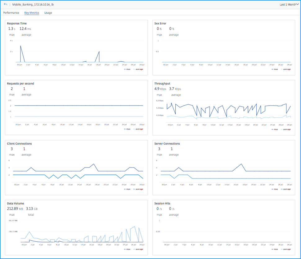
Click an application from the App Dashboard and select the Key Metrics tab to visualize the consolidated view of all metrics. Select the time duration from the list to analyze the metrics.

For each metric, you can view:
-
Max – Indicates the maximum value for the selected duration
-
Average – Indicates the average value for the selected duration
According to the example in the image, the max value for Response Time indicates 1.3 s. From the graph chart, you can analyze how many times the high response time has occurred for the selected time duration. Similarly, you can also view details for other metrics, analyze if the application has received a peak usage, and take decision to scale up the production environment.
Identify top 5 app maintenance window
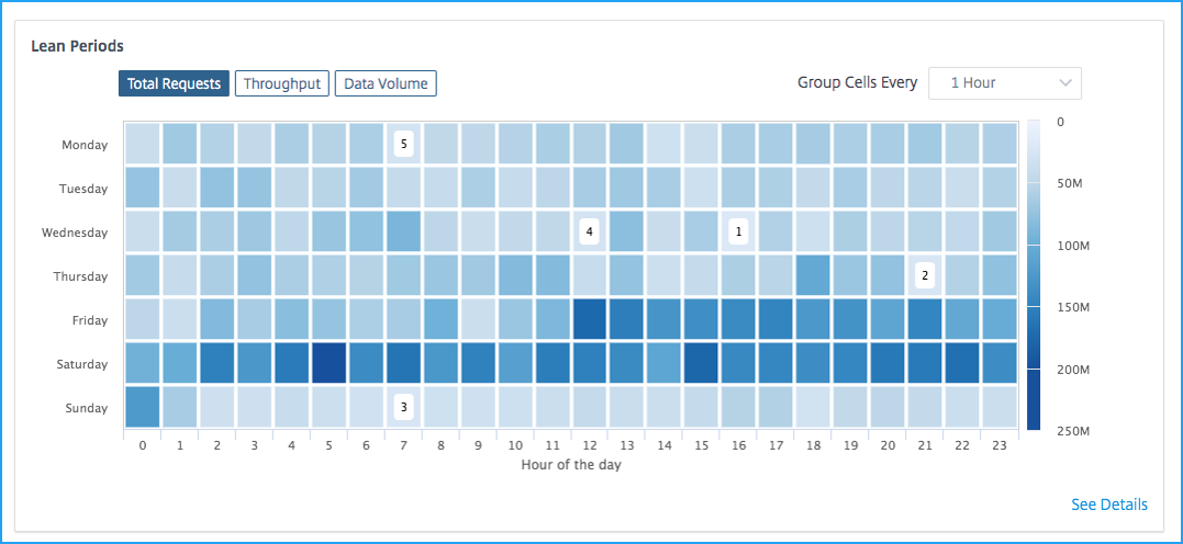
Click an application from the App Dashboard and select the Key Metrics tab to view the lean period for the application. A typical downtime for an application can be 1-hour, 2-hour, or 4-hour, depending upon the requirement. You can select the time from the list (1-hour, 2-hour, or 4-hour) that you want to plan for the downtime. After you select the time from the list, you can analyze the traffic for metrics such as Total Requests, Throughput, and Data Volume. You can select the right time to schedule for a downtime, when the application usage is less. The following example is to analyze the downtime for the 1-hour duration.

The heatmap view indicates the application usage for the selected time duration. The darker the color (blue), indicates the application usage is higher.
The heatmap view also suggests the top 5 least period (1, 2, 3, 4, and 5) to plan for the application downtime.
1 – Indicates the first suggestion for Wednesday from 4 pm to 5 pm
2 – Indicates the second suggestion for Thursday from 9 pm to 10 pm
3 – Indicates the third suggestion for Sunday from 7 am to 8 pm
4 – Indicates the fourth suggestion for Wednesday from 12 pm to 1 pm
5 – Indicates the fifth suggestion for Monday from 7 am to 8 pm
You can also select any other day and time to schedule a downtime, after analyzing the traffic for all other days.
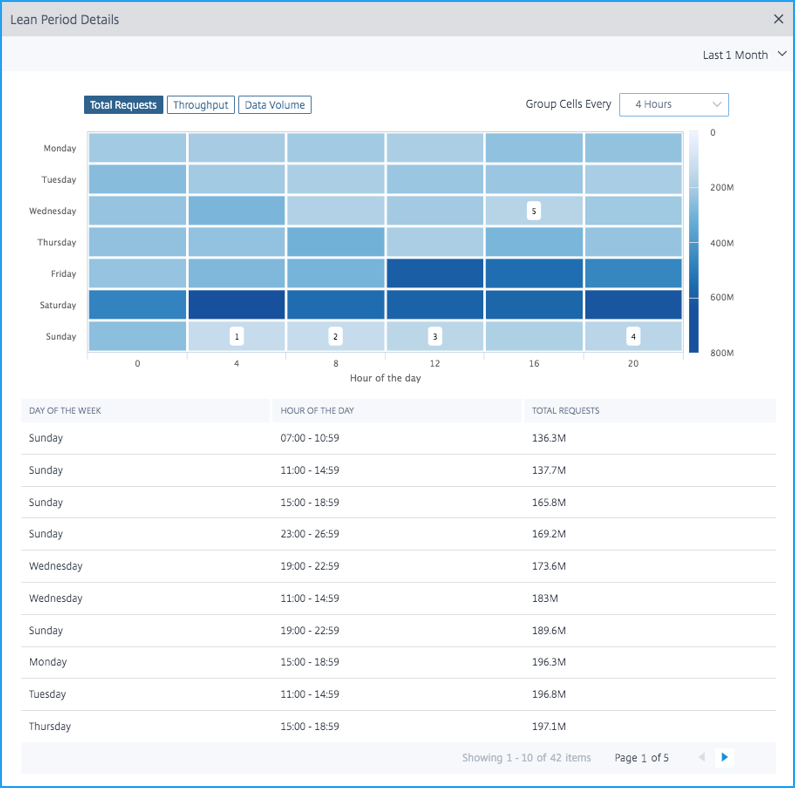
Click See Details to view further detailed information. Click the Total Requests, Throughput, or Data Volume tab to view details for the top 5 least period and also for the other days.
